- Blog
- 01.26.2022
- Data Fundamentals, Dev Dialogues
Analysis of Exponential Decay Using Matillion ETL for Delta Lake on Databricks
What does it look and feel like to generate an actionable insight from a large set of raw input data? In this article, I will do exactly that: Determine some extremely useful insight from volumes of IoT data. This will be an end-to-end worked example, first involving some data engineering and then moving into data science in a seamless way.

As the starting point I am going to reuse the semi-structured data set from an earlier blog. It comprises roughly 11MB of JSON data captured from an IoT device in a factory. The IoT device measures the rate of a chemical reaction by counting the frequency of gas bubbles going through an airlock. When shown as a scatterplot, the number of bubbles produced per minute looks like this:
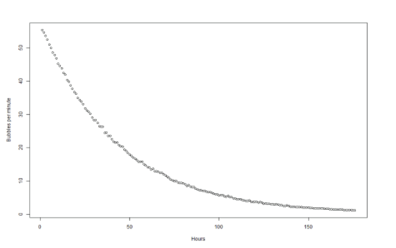
The rate is clearly slowing down, in what looks like an exponential way. The chemistry experts say that when the rate slows to just one bubble every two minutes, the reaction is effectively finished. For the sake of efficiency, I need to know exactly when that is going to be. The problem is that – especially after the 100 hour mark – the rate has flattened out so much that it has become difficult to predict.
So the two actionable insights I need are:
- Verification that the rate of slowing actually is a true exponential decay
- If so, when exactly the rate will reach the critical point that marks the end of the reaction
To help streamline the data engineering part of this analysis, I will be using Matillion ETL for Delta Lake on Databricks. Let’s take a look at how it can be done!
Data Engineering to verify exponential decay
The raw data I have is in semi-structured JSON format, and looks like this:
{  "metadata": {
    "timeunits": "seconds",
    "tempunits": "celsius",
    "base": "2021-10-01"
  },
  "data": [
    {
      "timestamp": "06:15:01.030",
      "temperature": 19.7451
    },
    {
      "timestamp": "06:15:02.090",
      "temperature": 19.7491
    },
    #################################################
    # About another 578,000 more lines of similar ...#
    #################################################
    {
      "timestamp": "23:59:59.227",
      "temperature": 19.7667
    }
  ]
}
There are more than half a million lines in total, so clearly I am going to need some automation to start making sense of it all.
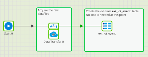
Loading the data into Delta Lake is easy using our Matillion ETL tool, with an orchestration job like this:
From that starting point as an unmanaged table, it is easy to process the data in Spark SQL using Matillion ETL Transformation Jobs.
I wrote an earlier blog post where you can find the transformation steps that convert the raw data into a Star Schema model. The aggregation looks like this:
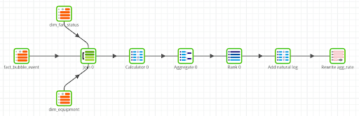
If you run this job yourself, you will be able to check the most important aspects:
- It starts with 144,560 rows, which is the granular data from the flattened JSON
- The aggregation step averages the data by day and hour, bringing down the rowcount to just 176 rows – perfect for regression analysis
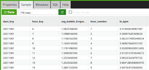
The first insight I want to establish is whether the rate of slowdown really is an exponential decay. If it is, then a natural log of the rate should be a straight line sloping downwards. In Matillion ETL’s data sample window, you can see the result of the push down to the Spark SQL LN function call, which implements the natural log:
In the function editor of the calculator component it looks like this:
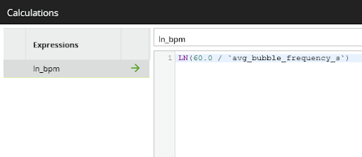
I will come back to that formula later. First, I need to switch into data science mode to check how well the data fits an exponential decay model.
Data Science
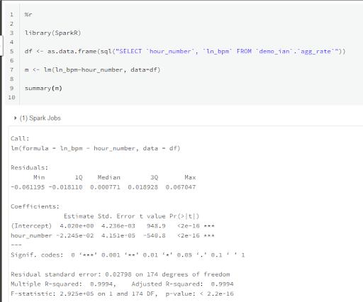
I have been using Matillion ETL for Delta Lake on Databricks to do the data engineering work so far. The data output from the aggregation I showed in the previous section was saved into a managed table named agg_rate. It is very easy to load it from there into an R notebook for statistical analysis.
%r library(SparkR) df <- as.data.frame(sql("SELECT `hour_number`, `ln_bpm` FROM `demo_ian`.`agg_rate`"))
This creates a plain R data.frame from the SparkDataFrame.
As a first test, I will create another scatterplot with those values, and add a linear model:
plot(df$hour_number, df$ln_bpm, xlab="Hours", ylab="ln_bpm")

m <- lm(ln_bpm~hour_number, data=df)

abline(m, col=2)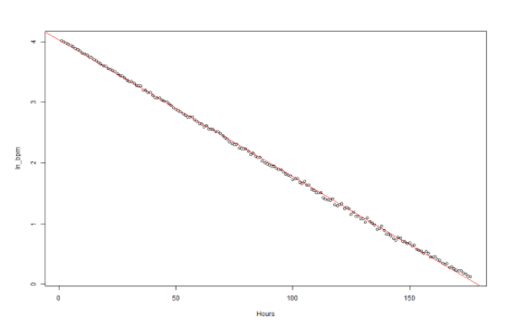
At first glance it does look like a nice straight line. But to verify statistically that the relationship is linear I need to check the correlation coefficient:
cor(df$hour_number, df$ln_bpm)
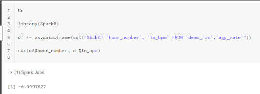
The result is a very strong negative correlation of -0.9997027, as you would expect from a straight line from the natural log of an exponential decay. But could it have occurred by chance?
cor.test(df$hour_number, df$ln_bpm) The resulting p-value of < 2.2e-16 demonstrates that chance correlation is extremely unlikely.
As a final check, I will plot the residuals to see if there is a pattern.
plot(df$hour_number, resid(m))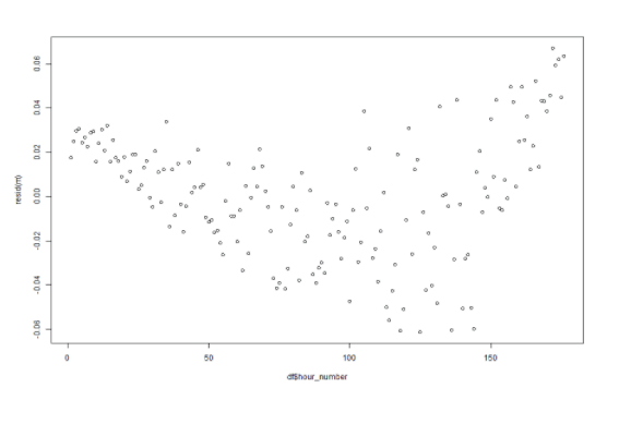
The result does look a little U-shaped, so there is probably some additional non random effect in play. But the differences are very small relative to the actual values, and I assess that it will not skew any conclusions to a large degree.
So, that is confirmation of the first insight: I am satisfied that the rate of slowing really is an exponential decay. With that information, I can move on to the second step.
When will the reaction finish? Applying a Linear Regression model
Now that I am certain the relationship is linear, I can use it to extrapolate forward and work out when the reaction is going to stop.
Every bivariate linear model has a slope and an intercept, which I can find from the linear model that I used in the graph earlier.
From the summary above:
- The intercept is 4.020
- The slope is -0.02245
Recall that the chemists say once the reaction speed decreases to just one bubble every 120 seconds then the reaction has ended. Now it is time to revisit the formula I showed in the Matillion ETL screenshot earlier.
Expressed in my R notebook, that moment will come when the dependent variable reaches the critical value -0.6931472:
log(60/120, exp(1))
It looks a little strange extrapolating the linear model below zero on the y-axis! But natural logs do go negative when the value is below one, and I am looking for one bubble every two minutes, which is 0.5 bubbles per minute.
Solving the equation in R gives this formula for the hour number:
(-0.6931472 - 4.02) / -0.02245
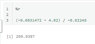
Right now we are at hour 176, so there are 34 hours to go until the reaction will end. This is the insight I have been looking for! It allows me to confidently plan the next batch of materials for the reaction, which enables me to run the factory at peak efficiency.
One shared data set, two environments, real insight
I started out with a large and messy set of semi-structured data, and used a unified data engineering and data science environment to generate actionable insights from it.
- Matillion ETL for Delta Lake on Databricks provided a way to streamline the data engineering aspects:
- Easy data loading through a visual orchestration task
- Processing and aggregating large data volumes through a visual data transformation task
- A Databricks Notebook provided the data science framework for running statistical tests and calculations
- One single data set was shared between the two environments in a seamless way

Ian Funnell
Data Alchemist
Ian Funnell, Data Alchemist at Matillion, curates The Data Geek weekly newsletter and manages the Matillion Exchange.
Featured Resources
Building a Type 2 Slowly Changing Dimension in Matillion's Data Productivity Cloud
A Slowly Changing Dimension (SCD) is a dimension that stores and manages both current and historical data over time in a data ...
BlogEnhancing the Data Productivity Cloud via User Feedback
Find a data solution that allows you the option of low-code or high-code, extreme amounts of flexibility, tailored for cloud ...
BlogHow Matillion Addresses Data Virtualization
This blog is in direct response to the following quote from ...
Share: