- Blog
- 07.29.2021
- Data Fundamentals, Dev Dialogues
Numeric Densification for Machine Learning with Matillion ETL
Many of our customers are using Matillion ETL to prepare data for artificial intelligence (AI)and machine learning (ML) algorithms. Sometimes they are training data to build an ML model, and sometimes they are preparing data to input to an existing model.

In either case, any gaps or inconsistencies in the input data will adversely affect the quality of the output. Garbage in: garbage out.
But there’s a fix to help fill the gaps: there are some densification techniques that can fill in blank numeric values, both as predictions and in retrospect. This is especially useful with IoT sources, where transmission can be unreliable and the data can be patchy. Let’s look at how it works.
We will use AUD/EUR exchange rate data.
Start with the raw data
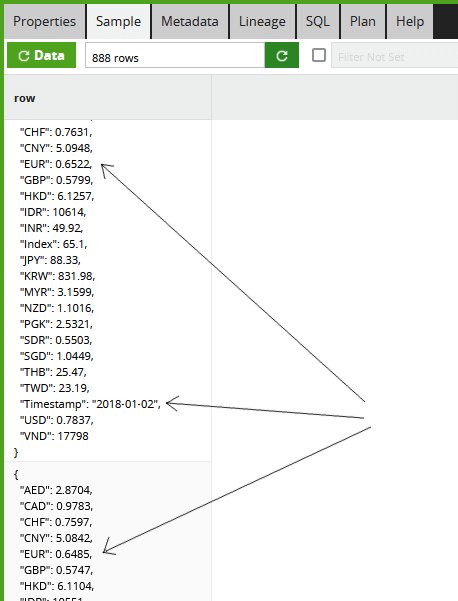
To start the data transformation, I have the JSON data containing historical exchange rates from the Reserve Bank of Australia.
The full Transformation Job is part of the Matillion ETL sample jobs, and looks like this:
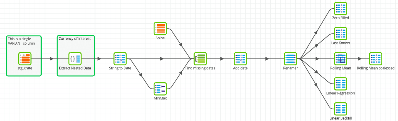
On the far left-hand side, the input records are in a single VARIANT column in a staging (or “bronze”) table named stg_xrate.
I can view the raw data using the Sample tab of the Table Input component. I can pick out, for example, that the AUD/EUR exchange rate was 0.6522 on 2018-01-02, and it changed to 0.6485 the next day.
The data is not so easy to handle like this, so the first Matillion ETL transformation step is to use an Extract Nested Data and a Calculator to flatten the data into relational format showing just the EUR rate, and to convert the timestamp string into a real date object.
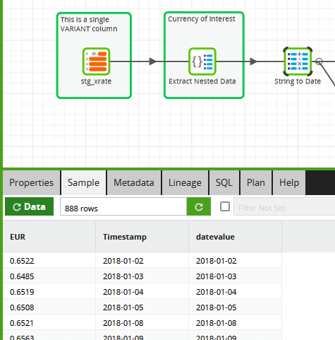
After this step, there are still the same number of rows (888), but now it’s much more accessible. It’s easy to plot the AUD/EUR exchange rates in Tableau as a time series for a quick initial view.
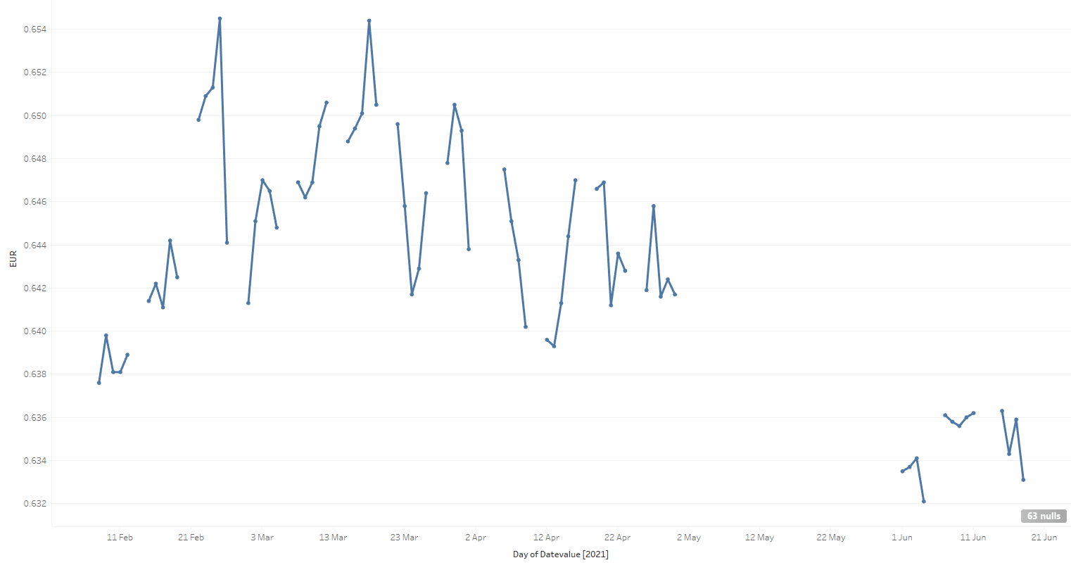
When we do that, it’s immediately obvious that there are many gaps between the observations. There are two main reasons why the gaps happen:
- No value was recorded. These spaces correspond mainly to weekends and Australian public holidays, when official exchange rates are not recorded. In an IoT analogy, this is like a sensor failing intermittently.
- The value was recorded perfectly fine, but I failed to pick it up. These spaces correspond mainly to me forgetting to switch on the data capture job 🙂 The big gap in May, shown above, is an example of this pilot error. An IoT analogy is a receiver or a transmission line failing.
Missing data does not mean that there was no exchange rate on those days!
If you had that chart on a piece of paper, you could probably start to sketch in some of the missing values. That kind of data transformation is called numeric densification. Let’s dive into some ways you can do it electronically with Matillion ETL.
Numeric densification techniques
There are two kinds of missing values: Two problems to solve
- The granularity itself, in other words, missing records
- The values that should appear in those missing records
Adding missing records
For this dataset I’m expecting exactly one record per day, so a good technique to add missing records is known informally as a left-join-to-spine.
The “spine” is a virtual table at the correct granularity, and with no missing records. In this case, it comes from a Snowflake table generator, accessed simply through a Matillion Generate Sequence component.
The actual time span of the spine needs to be the minimum and maximum date range of the exchange rate data. I can access those using an Aggregate Component, which is the one named MinMax in the screenshot below.
In the “Find missing dates” Join component, the minimum and maximum dates are used in a theta (range) join to make the spine exactly the correct size. Inside the join, Snowflake’s DATEADD function converts an integer spine sequence into a sequence of dates.
Once the spine is in place, it can be left-joined to the original data using a second join in the “Find missing dates” component.
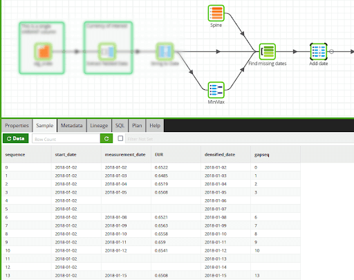
It’s always good to check how the data looks while building Matillion Transformation Jobs. The screenshot above shows the first few records in the Sample tab after the Join component.
You can see among the columns:
- The numeric sequence from the spine.
- The start date of the exchange rate history, from the MinMax component. Using this with another DATEADD creates the missing measurement dates as a “densified date” column.
- The real measurement date and the EUR exchange rate. The screenshot includes the first two missing weekends.
Adding missing values
Once the missing records have been filled in, the placeholders become available for the missing exchange rate values.
In the next few sections I’ll demonstrate Matillion ETL implementations of five deterministic methods for filling missing values. Four will be predictive, and one will be a retrospective backfill.
Predictive methods start with the simplistic Zero Filled, and moving on to two analytic function driven approaches: Last Known and Rolling Mean. Then a more sophisticated one based on Snowflake’s linear regression SQL functions.
A retrospective backfill has the benefit of knowing both past and future values. This is the Linear Backfill technique.
For each method I will show a graph of how the actual measured values plot against the newly added densified values.
Zero Filled
To achieve this, a Matillion Calculator component implements the NVL function to replace missing values with a hardcoded zero.
This is the fastest possible algorithm. Although you can see from the graph below the densified values in blue are nowhere near the measured values in orange.
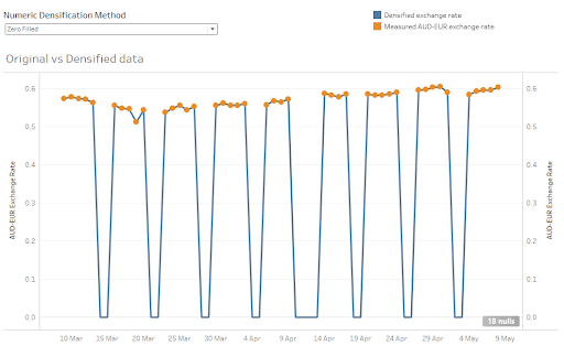
A different number might be a better choice. But for this data set, choosing any fixed number is a rather unsatisfactory method. It needs to be more data-driven.
Last Known
This technique uses Snowflake’s LAST_VALUE analytic function with the IGNORE NULLs option. For every value that is missing, it searches backwards until it hits an actual value, and uses that.
As you can see from the graph below, it’s far superior to just filling in with a hardcoded zero. The densified values in blue are very close to the measurements in orange.
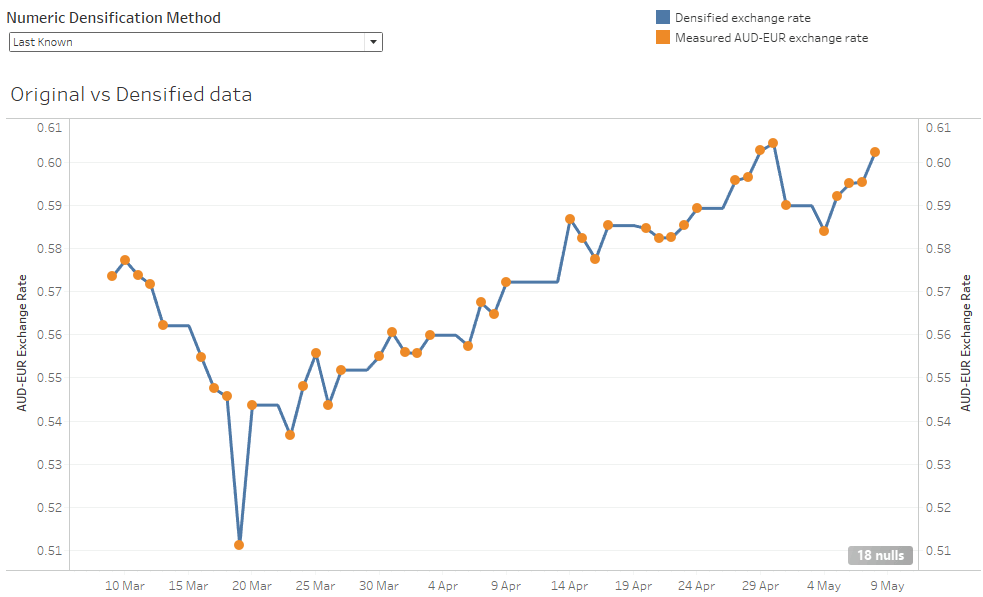
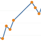
The thing that looks most odd with this technique are the absolutely straight lines. The bigger the gaps, the more artificial it becomes. A completely straight line can be followed by a sudden large change.
You can see it with a magnification into the center of the chart. Replacing a multi day gap there’s a flat line where the algorithm has chosen the same last-known value for several missing days in a row. After the densification finishes the line suddenly shoots upwards to meet the next measured value.
Rolling Mean
This is another of Snowflake’s analytic functions: an average over a sliding window of a number of previous days.
The assumption is that the future value won’t deviate far from where it has been in the recent past. This example is implemented using a Matillion Window Calculation Component, with the offset preceding value set to three.
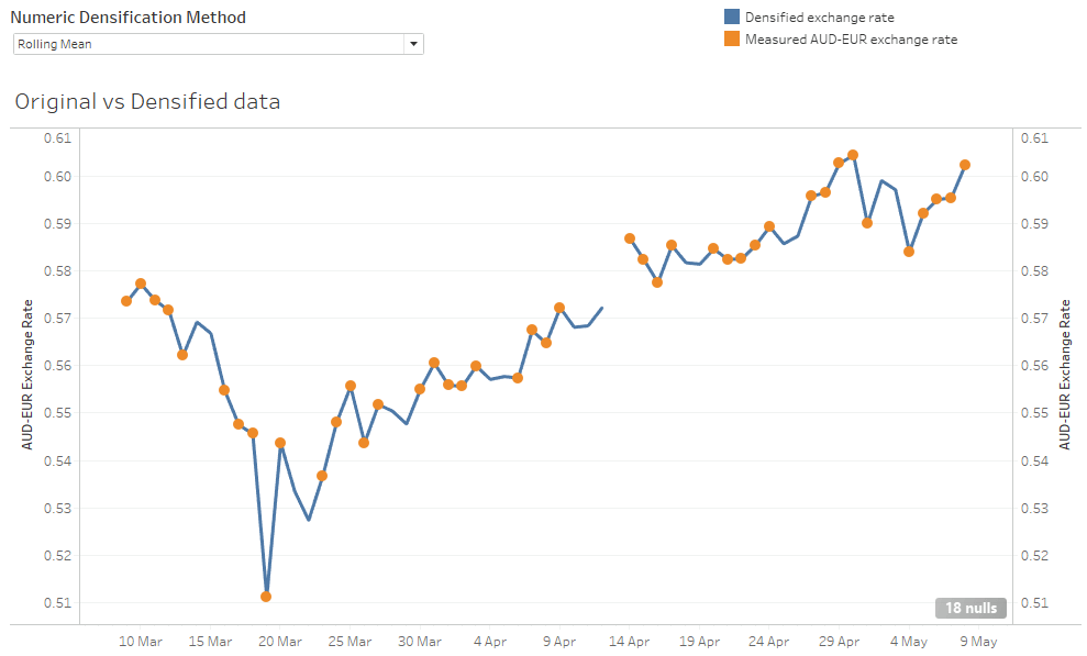
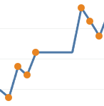
It’s clearer with another zoom in to the points near the center of the screenshot above.
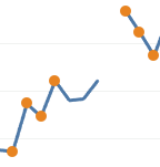
After the four measurements on the left, the blue line extrapolates forward for three days using a rolling mean. Each of the three newly added densified values is the mean of up to the last three measured values. The last densified value only has one real measured value to use, so it’s exactly equal to the last actual measurement. After that point a gap remains because no more actuals were available within the prior three days.
This method solves the straight-lines problem of the “Last Known” method. But there are still two drawbacks:
- It can leave gaps because it can only look forward the same number of days as the averaging looks backward. And the further backward you look, the more you are allowing the algorithm to be influenced by old data
- It’s driven by averages from the recent past, so it can never predict future values outside the range of the previous few days
To improve, it would be great to look at the trend. If the rate has been going up for the last few days, then it’s probably fairly safe to assume that it will keep going up, in the short term at least. Enter linear regression…
Linear Regression
This statistical technique looks at the past few measurements and finds the best straight line through them. Then it uses the direction of that line to predict the next missing value.
The Matillion implementation uses a self-join in a SQL component to find all the actual measurements within the past 10 days. Then an ARRAY_CONSTRUCT and an aggregation to run Snowflake’s REGR_SLOPE linear regression function.
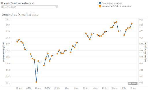
This is the most sophisticated algorithm of the five being demonstrated, and the most computationally expensive. In general, it requires one more self-join per missing day. In this example, I only included just one self-join, so you can see every gap in the sequence is followed by the blue line predicting one extra day.
Compared to “Last Known” and “Rolling Mean”, this method predicts fewer missing values, but it arguably does a better job. In the detail below from the middle of the chart you can see that the blue line is heading into the gap in the right direction.
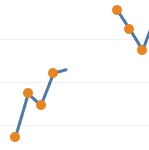
In particular, notice that the first missing day is predicted to be higher than any of the immediately previous actual values. Linear regression looks at the direction of change, which is generally upwards in that area. Whereas the Rolling Mean prediction for the same day was lower, and probably less accurate, because it just used the average of the previous few days.
Linear Backfill
If you have the benefit of hindsight, and are filling in missing values historically then a linear backfill is a good choice.
The Matillion implementation uses Snowflake’s LAST_VALUE and FIRST_VALUE analytic functions in a SQL component. It assumes that the missing measurements are the exchange rate changing from its last known value to the future value in equal sized steps.
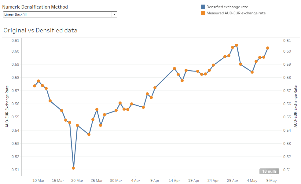
The result is that all the gaps are completely filled by sensible-looking straight lines. This is probably how you would fill in blanks on a piece of paper if you had a ruler and a pencil.
This method is not predictive at all. It depends on knowing the future value so it can draw a straight line to that value. But it’s very suitable for filling in historical blanks when preparing training data for an ML algorithm.
Try it for yourself
You can use all the numeric data densification methods shown here inside your Matillion ETL transformation jobs. They will be particularly useful if you are preparing data as input to train or use an ML algorithm.
If you would like to run this job yourself on your own Matillion ETL instance, you can install it as part of the Matillion ETL sample jobs. If you would just like to experiment with the outputs, you can jump straight to the featured Tableau Public viz.
Numeric densification is just one example of Matillion ETL’s data transformation and integration capabilities. To see how Matillion ETL could work with your existing data ecosystem, request a demo.

Ian Funnell
Data Alchemist
Ian Funnell, Data Alchemist at Matillion, curates The Data Geek weekly newsletter and manages the Matillion Exchange.
Featured Resources
VMware and AWS Alumnus Appointed Matillion Chief Revenue Officer
Data integration firm adds cloud veteran Eric Benson to drive ...
BlogHow Matillion Addresses Data Virtualization
This blog is in direct response to the following quote from ...
BlogMastering Git at Matillion. Exploring Common Branching Strategies
Git-Flow is a robust branching model designed to streamline the development workflow. This strategy revolves around two main ...
Share: