- Blog
- 01.15.2020
Dashboard examples: The good, the bad and the ugly
Data visualisation and dashboards in particular can form a crucial component of your analytics strategy. However, it can be easy to get them wrong. To gain a better understanding of what makes a good or bad dashboard, it can be helpful to look at some real-life dashboard examples.
With the rapid rise of information technologies, businesses have increased their demands for high-quality performance data. The difficulty comes in finding a means of presenting this information to employees in a way that is quick and easy to interpret—and this is where dashboards come in.
Dashboards are an effective way to present large volumes of data, in a complex, user friendly manner. They can be a great tool for businesses, but only if they are designed and used correctly.
There are plenty of good dashboard examples out there. Sadly, there are also plenty of examples to be found where business dashboards are poorly designed, and consequently the value that they bring is severely diminished.
In this post we explore the good, and the bad.
Good Dashboard examples
Here are some good dashboard examples, you might find some tips you could use yourself.
1. Wave Dashboard
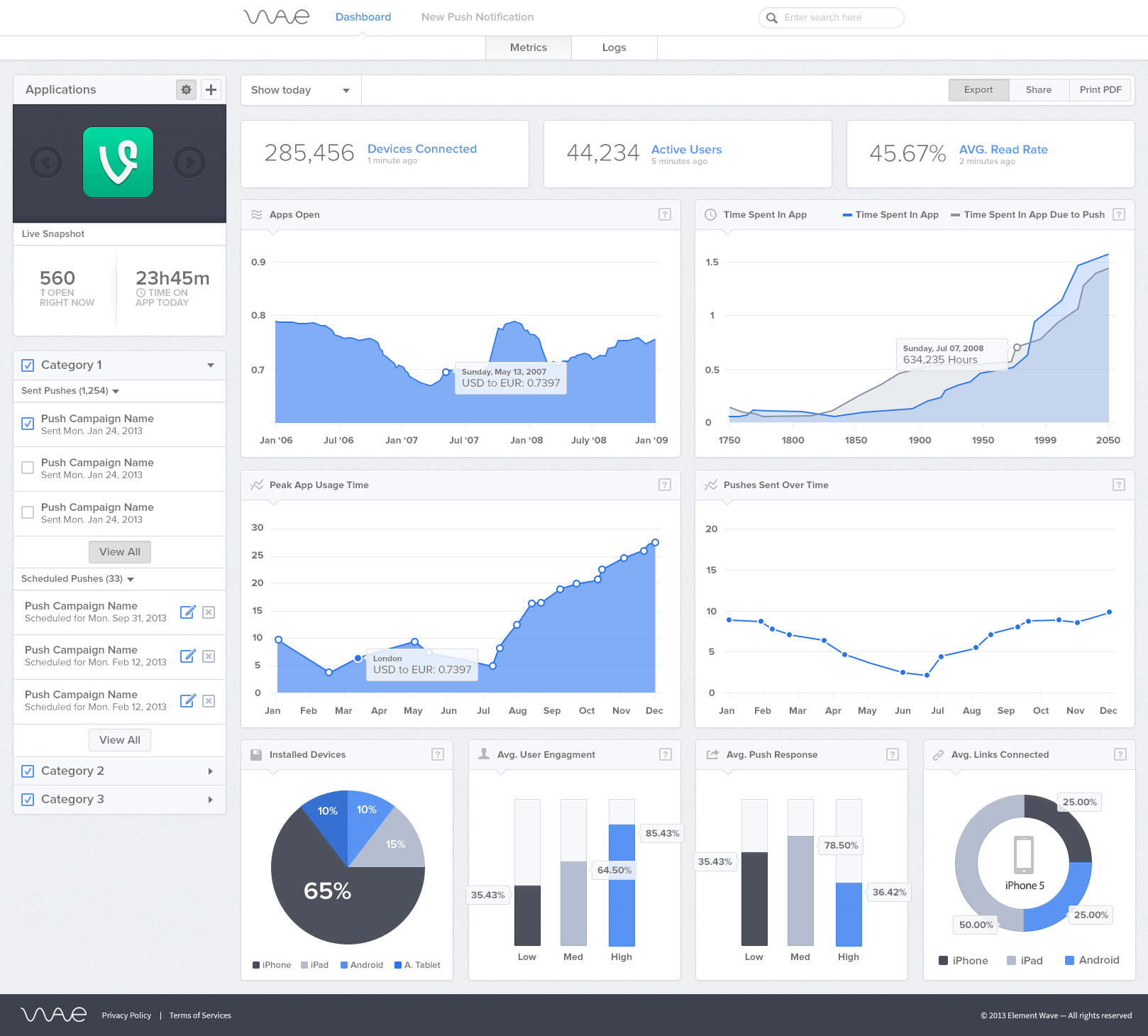
This dashboard example from Wave is a great example of how a simple structure can be used effectively to display information.
- The dashboard looks visually appealing but does not draw attention away from the data itself by using distracting and unnecessary graphics.
- The colour scheme used throughout the dashboard helps it to look bright, clean and clear.
- The amount of data presented in each graph is sufficient enough to provide value without looking cluttered and hard to interpret.
2. Wufoo
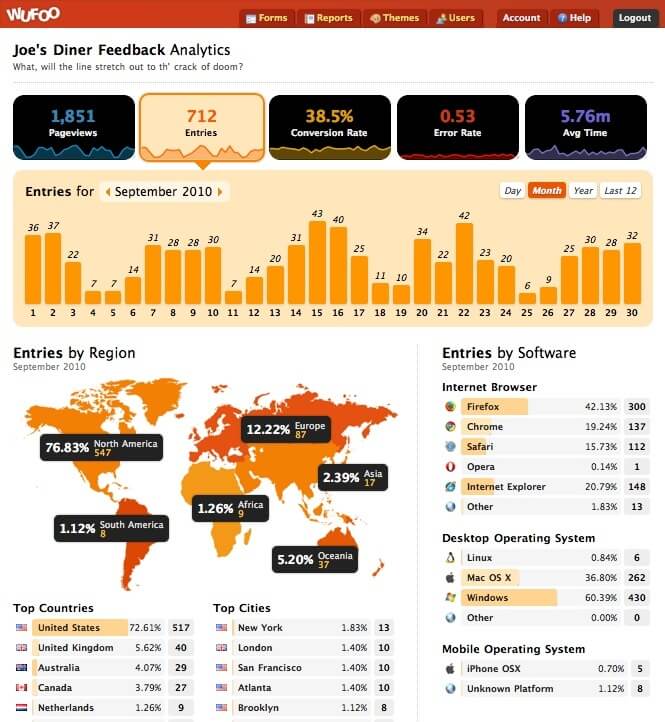
Another of our good dashboard examples comes from Wufoo
- This is a great example of a dashboard which allows the user the ability to drill down and gain a much deeper insight as they make the way down the dashboard.
- The dashboard has a flow structure which allows the user to select the area of interest and then allows then to see key metrics in terms of variables such as country, region and city.
- The dashboard also effectively incorporates filters which allow the user to view data based on time scales such as day, month, year or last 12 months.
3. Fox Metrics
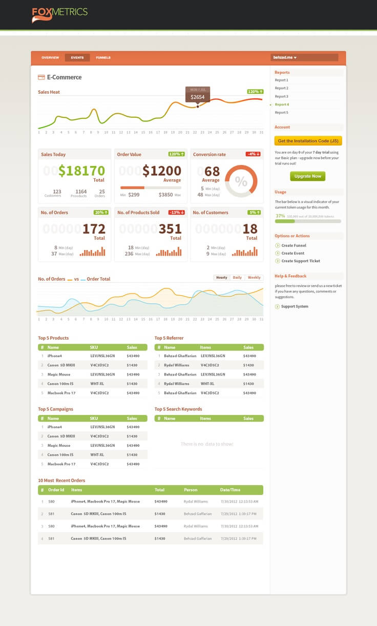
The final one of our good dashboard examples comes from Fox Metrics.
- This dashboard is also very clear and well structured.
- The dashboard incorporates a significant amount of data, taking the form of numerous different data visualizations and yet is does not look cluttered.
Bad Dashboard examples
Bad dashboard examples are much easier to come across
1. London City
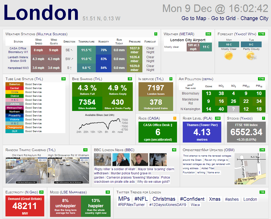
- This London City dashboard attempts to present far too much information in a small space and has ended up looking extremely cluttered and distracting.
- There are too many distracting colours, many of which serve no real purpose and this draw focus away from the data itself.
- There are also far too many different types of data visualization on the dashboard with no clear linkage between them.
2. Dundas
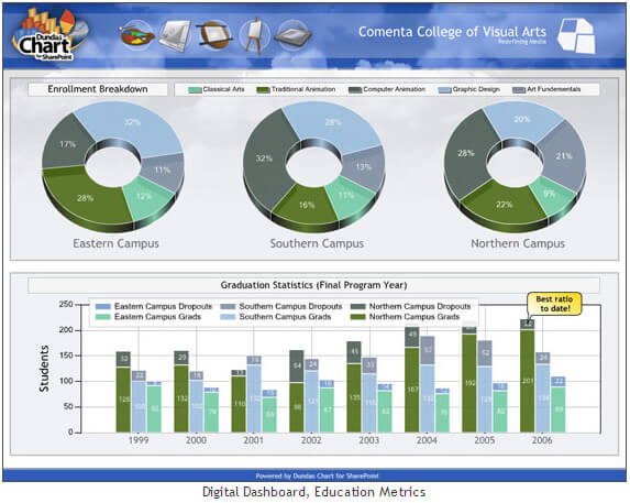
- The main problem with this dashboard from Dundas is that the same colour scheme is used for both the pie charts at the top and the bar charts at the bottom.
- On first glance the user therefore assumes that there is some kind of link between the two and associates the coloured sections of the pie charts with the respective coloured bars below. In fact the two sets of information are not the same and therefore the colour scheme used only complicates things further.
- A further fault is the use of 3D effects on the pie charts at the top. In an attempt to make the charts look more visually appealing, the creator has actually made it more difficult for the user to read and interpret.
3. Transportation Improvement Board
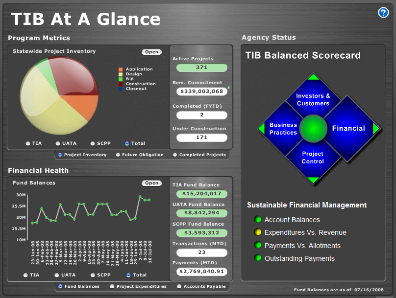
The final one of our bad dashboard examples is this dashboard by the transportation improvement board. This example highlights how dashboard design can often go wrong.
- The fill effects that have been used on the pie chart in the top left hand corner are completely unnecessary and make it difficult to interpret the size of each slice.
- More worrying however, is the Fact that there is a legend to the right of it as well as a number of data labels underneath. This makes it extremely difficult to interpret what information the chart is actually displaying, especially at a glance.
Featured Resources
What Are Feature Flags?
Feature flags are a software development tool that has the capability to control the visibility of any particular feature. ...
BlogHow Your Data Teams Can Do More With Marketing Analytics
Improve your marketing analytics with Matillion Data Productivity Cloud that enables businesses to centralize and integrate ...
BlogThe Importance of Data Classification in Cloud Security
Data classification enables the targeted protection and management of sensitive information. Personally Identifiable ...
Share: