- Blog
- 09.09.2020
A Demonstration of the Central Limit Theorem Using Matillion ETL for Google BigQuery
Data scientists today experience a common dilemma: The need to use a desktop statistical tool such as R to perform analysis, and the practical problems of handling large volumes of data inside that tool. R and other statistical tools are sophisticated, but lacking in a few areas:
- Scalability to handle large datasets
- Simplicity, being focused on hand-coding
- Speed, in that all of that code needs to be maintained
A tool like Matillion ETL can be extremely helpful for data scientists in exploring and preparing data for use. In this article, we will show how. As an example, we will explore the central limit theorem and how it applies to real data, using R, Google BigQuery, and Matillion ETL for Google BigQuery.
What is the central limit theorem?
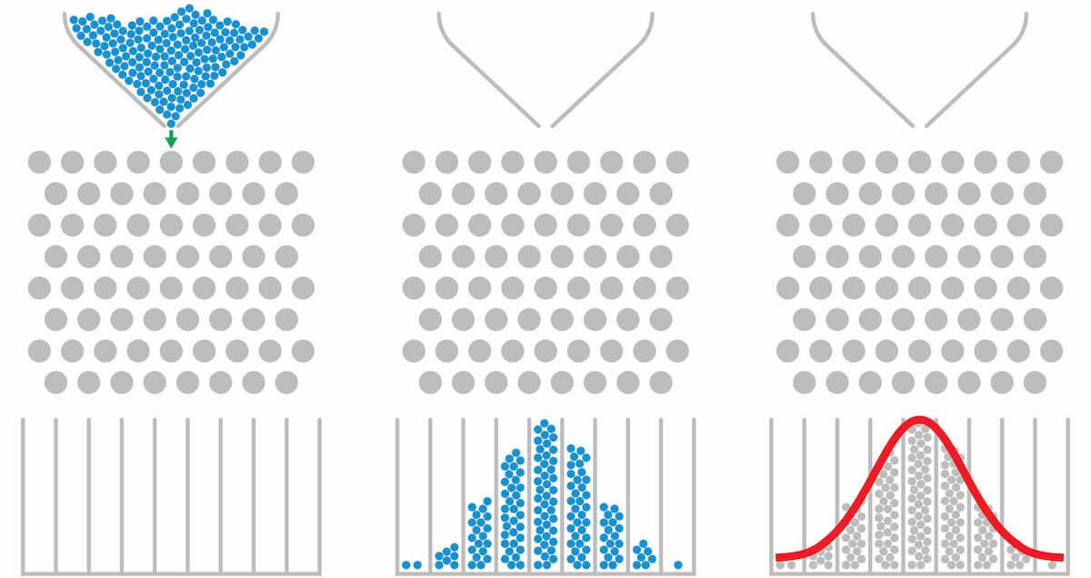
The central limit theorem is widely invoked in inferential statistics. It concerns the distribution and standard deviation of mean values when random samples are taken from a population.
Looking at the central limit theorem requires access to a data population that’s large enough to be interesting. So we’ll start with a 70GB dataset with roughly 200 million records. It’s difficult to load all of that into an R data frame, so we will use Matillion ETL in conjunction with Google BigQuery to access and manipulate that data quickly, efficiently, and visually, with no need for any hand-coding.
The investigation will require a set of samples, so along the way we’ll demonstrate a technique to perform random sampling using Matillion components.
Once Google BigQuery and Matillion have aggregated the data into a manageable size, we’ll demonstrate the handover to R for the statistical work and graphical outputs.
Using flight data as our sample
At Matillion we often use domestic flight data published by the Bureau of Transportation Statistics (BTS). The number of minutes a flight was delayed is a good candidate for this article, because the data is not normally distributed, and so would ordinarily present a challenge to analysts. The population looks like this:
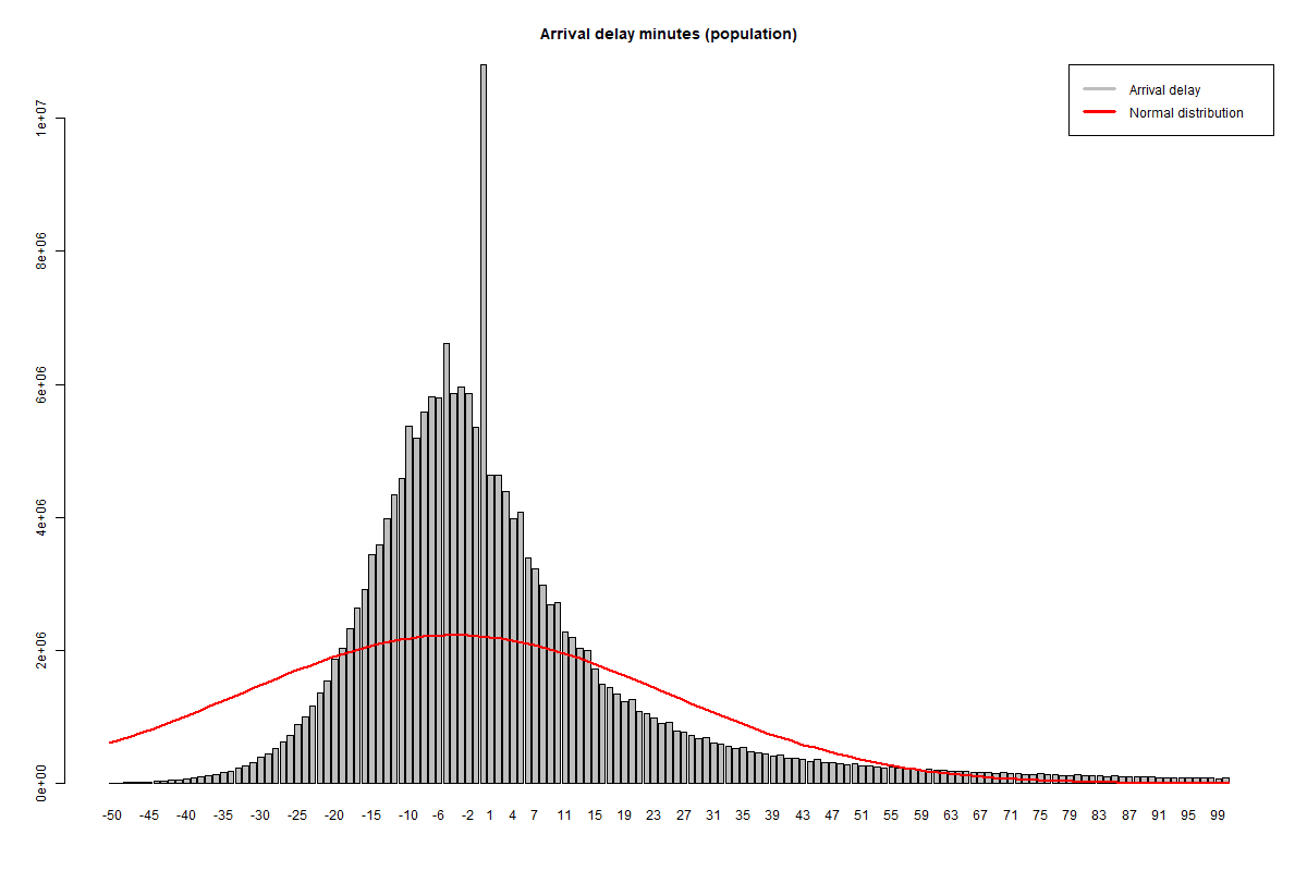
Flight arrival delay – population data (see R code for this experiment)
A normal distribution with the same total probability is superimposed in red, and it’s visually apparent right away that the delay times are not normally distributed:
- The peak is narrower
- The data is right skewed
- There’s a strong mode value at 0 minutes
Details of how to recreate the above chart in R are shown at the end of this blog, along with the Shapiro-Wilk test to check if the population might be normally distributed. Both of those derivations start with data that has already been aggregated down from the initial 200 million records in the raw dataset, so we’ll look at those steps first.
Google BigQuery external tables with Matillion ETL
The solution architecture starts with the large, raw BTS datafiles held in Google Cloud Storage. These are referenced in Google BigQuery as a single external table. A Matillion ETL job orchestrates the data movement and aggregation, and finishes with two outputs to database tables:
- Unload tmp_arrdelay, from the tmp_arrdelay table, containing an aggregation of the flight arrival delays, from 200 million down to about 2000 rows
- Unload tmp_samples, from the tmp_samples table, containing the hundred or so random sample aggregates
The main Matillion job is shown below. You can upload this job file into your own Matillion instance for a much more detailed look at the External Table definition.
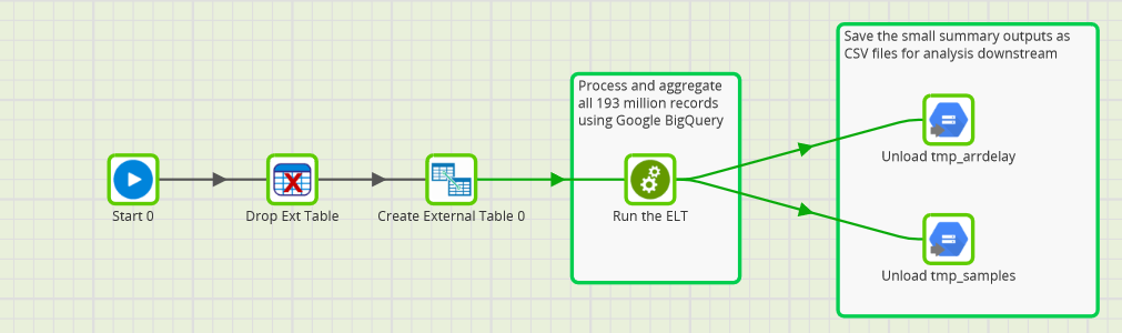
Matillion Orchestration Job
The generated CSV files are tiny in comparison to the initial dataset, so they are easy to load into R.
All of the really interesting work, including the heavy lifting of transformations and aggregations, happens inside the “Run the ELT” task, which is a Matillion Transformation Job.
Transformations and aggregations
Matillion Transformation Jobs contain all the data manipulation such as integration, adding derived columns, and aggregations.
This example starts with a query against the raw CSV datafiles in Google Cloud Storage, using an external table input component that brings all 200 million records straight into the world of SQL.
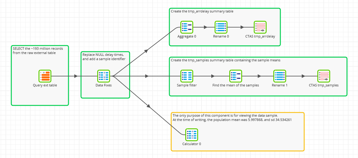
Matillion Transformation Job
It doesn’t look much like SQL, but that’s what’s happening behind the scenes, and it’s what we mean by saying there’s no need for hand-coding!
You can see from the overall structure of the job above that there are three main outputss:
- An output to create an aggregated frequency table of arrival delays
- An output to create an aggregated table of sample means
- A calculation output, which doesn’t actually create a table: it’s just there for visual inspection of the population parameters
All of these outputs contain two derived columns in the Data Fixes component:
- Applying a business rule to replace missing delay values with a zero. In Google BigQuery terms, this is a COALESCE function.
- Allocating records into random buckets for sampling (more on this subject later). In Google BigQuery terms, this uses the RAND function
Creating the frequency table
This part of the transformation logic is quite simple, and just performs an aggregation to the level of the arrival delay value in minutes, using an Aggregate component.
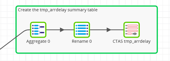
There’s not much to add to the transformation at this point: You just need to rename the columns and save the output to a new Google BigQuery database table named tmp_arrdelay.
There are about 2000 distinct values, which is a really easy volume for R to handle.
The values range between -1437 at one end (a suspiciously early flight, probably an invalid outlier), and 2794 at the other extreme. This is obviously a greater range than 2000. Around zero, there are no gaps between the values. But that does not apply in the long tails – for example, there is a big gap between -1437 and -1426, and between 2695 and 2794 at the other end. It’s quite easy to handle those gaps in R, so we won’t bother to fill them with zeros here.
Random Sample Means
This branch is a bit more sophisticated. It’s important to have truly random samples, so we need a way to randomly select samples from the population.
The method chosen here is in two stages:
- In the Data Fixes step, add a new column to every record containing a random integer between 0 and 10000. This random integer is generated by Google BigQuery’s standard SQL pseudo-random RAND() function in a Matillion Calculator component.
- In the Sample Filter step, only choose records where the above integer is exactly divisible by 97. (This value was chosen because it’s a prime number near 100.) The result is a set of 2 million records containing 104 distinct sample groups.
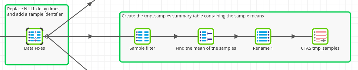
Beyond the random sampling, the steps are identical to the previous frequency table logic, with an aggregation down to 104, followed by metadata renaming and the creation of a new table containing the samples.
Of note:
- Strictly speaking, we are not sampling with replacement. One record can only be in one sample. However, given that we are only taking 1/97th of the records, it’s unlikely to have a large effect.
- Google BigQuery permits you to distinguish between the standard deviation of the population and the standard deviation of samples (with Bessel’s correction). We are using the STDDEV_POP function here.
Viewing parameters of the population data
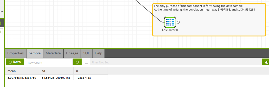
One of the things that makes Matillion development quick and low-maintenance is the ability to view data at any point on its transformation journey.
You can click into the Sample tab of any Transformation component and view the data at that step. You could easily do that with the Query Ext Table component, for example, to verify the initial rowcount of 193,387,188.
 Using the Sample tab
Taken from the Calculator component at the end of the third transformation branch, the population mean at the time of writing was 5.997868, and the standard deviation was 34.534261.
Pricing and scalability
Matillion does almost no work itself to perform these large aggregations: it’s all pushed down onto Google BigQuery. During testing, the job ran inside 60 seconds on a n1-standard-2 VM with 2 vCPUs and 7.5 GB memory (i.e. specs similar to a mid-range laptop).
Google BigQuery’s pricing is fixed at $5 per terabyte queried, and after compression each query scans roughly 8GB, at a cost of 4 cents on demand.
The analysis documented here requires that you run the query three times:
- To show the mean and standard deviation in the screenshot above
- Once to generate each of the two output tables
This is the source of Matillion’s scalability. With Google BigQuery, we are using Matillion ETL to very quickly crush 200 million rows down to a few thousand, at a cost of about 15 cents.
Empirical tests
The goal of this experiment is to check if the predictions of the central limit theorem hold true on real data. Let’s see how it works out!
Distribution
According to the central limit theorem, the sample means should form part of a normal distribution, centered around the mean of the population.
Plotting the 104 sample means visually, with a theoretical normal distribution superimposed in red again, it looks fairly close at first glance.
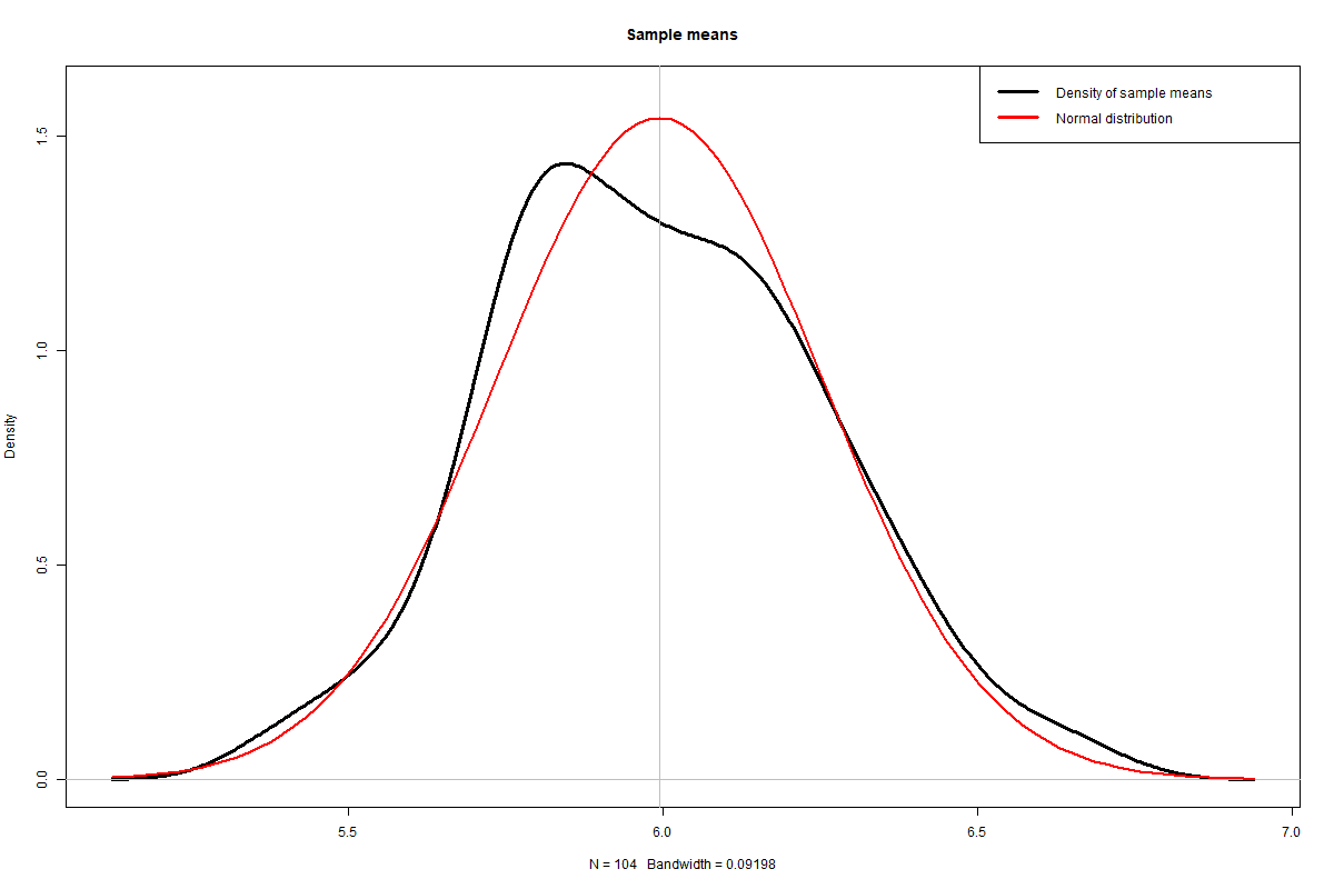 Density distribution of sample means (see R code for this experiment)
If you run the experiment multiple times, you will always see a broadly normal distribution, with some lumps and bumps caused by the randomness of the sampling.
In all cases, the shape will be close to the bell curve of the normal distribution, and mathematically speaking, it should be close enough not to fail the normality test. This can be verified with another Shapiro-Wilk test, (available at the end of the blog.)
It’s not infallible, but you should expect a p-value above 0.05, and in some cases well above that threshold. This value indicates that it’s not statistically valid to reject the null hypothesis. This result does not actually prove that the distribution of the sampling means is normal: simply that there’s not enough evidence to be certain it isn’t.
One other visual check is to run a Q-Q plot, also shown at the end of the blog.
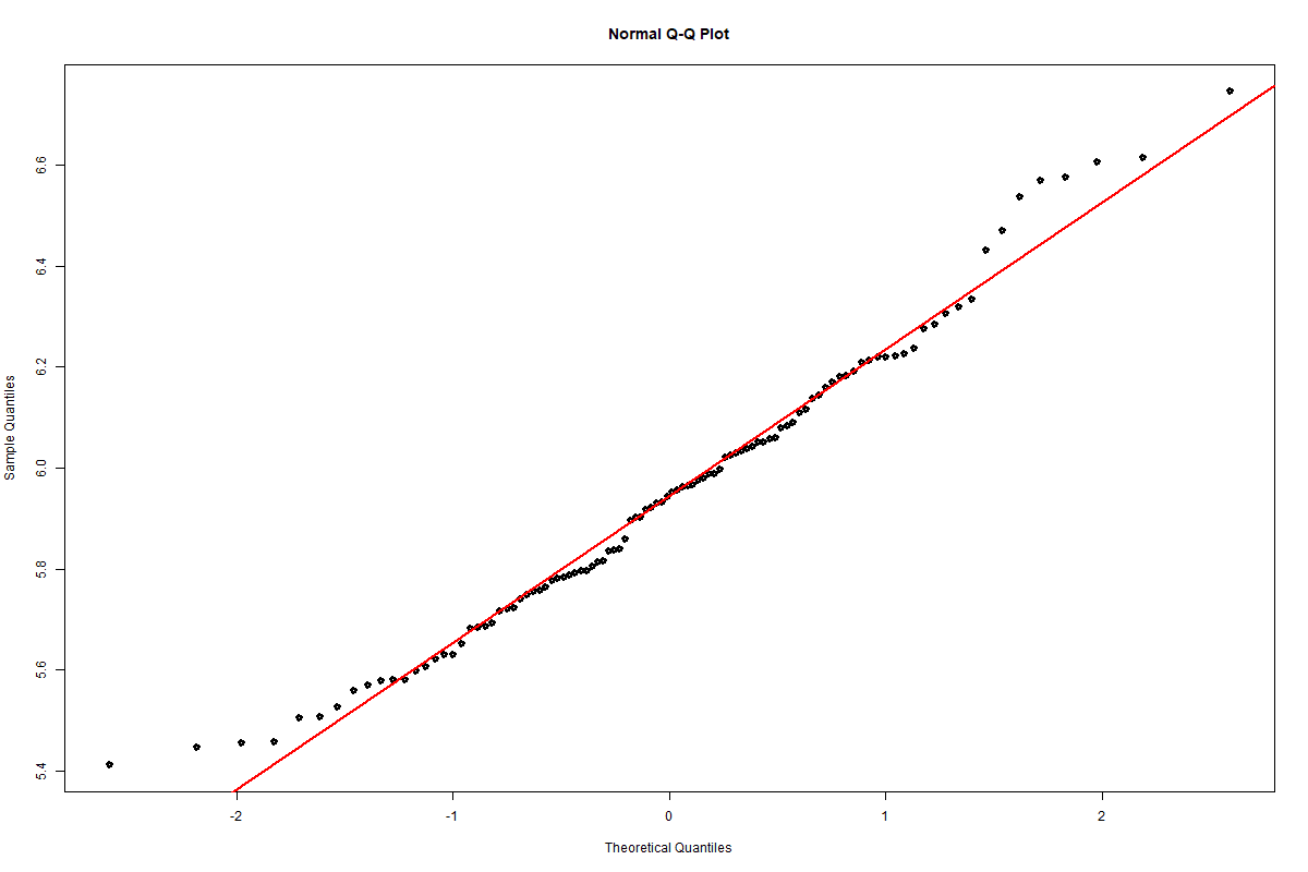
Q-Q plot of the sample means (see R code for this experiment)
Again, this is not infallible but visually it’s pretty close to the straight line you would expect from a normally distributed data set.
So far so good!
Standard deviation
The second prediction from the central limit theorem is that the standard deviation of the sample means should be the population standard deviation divided by the square root of the sample size.
We saw from the Transformation Job that the standard deviation of the population was 34.534261. There were 104 samples, ranging from 19005 to 19701 in size, with a mean sample size of 19349.
So we would expect a standard deviation of 34.53426119349 or around 0.25
The R code for this test is shown at the end of the blog. The standard deviation taken from the 104 samples was measured at 0.29, and so is within a few percent of the theoretical value, again confirming the prediction.
Summary
This article has hopefully brought to life some of the rather dry predictions made by the central limit theorem, using a technology stack comprising:
- Matillion ETL for Google BigQuery
- R, for its graphing and statistics functions
This combination of tools enables you to take advantage of:
- Matillion ETL’s ease of use, to make data exploration and preparation accessible and fast
- Google BigQuery, to achieve great scalability in a cost effective way
- R, as a familiar data science platform
R code for this experiment
Matillion ETL doesn’t generate R code, or have anything to do with the R runtime. Data is passed between the tools simply within CSV files, which are easily accessible to both. We’ve included these samples below for convenience if you want to follow along, do the same analysis, and create the same charts.
Flight arrival delay – population data
Starting with the data exported to GCS from the CTAS tmp_arrdelay component, the R code to create this chart is as follows:
raw_arrdelay <- read.table("tmp_arrdelay.csv", sep=",", header=T, quote='', fill=T)

df1 <- merge(data.frame(arrdelay=min(raw_arrdelay$arrdelay):max(raw_arrdelay$arrdelay)), raw_arrdelay, all.x=T)
df1$count_arrdelay[is.na(df1$count_arrdelay)] <- 0

minx=-50 maxx=100

barplot(subset(df1, arrdelay >= minx & arrdelay <= maxx)$count_arrdelay, names.arg=minx:maxx, main="Arrival delay minutes (population)")

curve(dnorm(x, mean=5.997868-minx, sd=34.534261)*sum(df1$count_arrdelay), lwd=2, col=2, add=T)

legend("topright", col=c("grey", "red"), lty=1, lwd=3, legend=c("Arrival delay", "Normal distribution"))
Shapiro-Wilk normality test (population)
Starting with the data frame derived for the population data chart above, the R code to run the test is as follows:
shapiro.test(df1$count_arrdelay)
The null hypothesis is that the underlying data is normally distributed, and that this graph came about by chance. The low p-value indicates that it’s extremely unlikely for that to happen, so we can assert that the population is not normally distributed.
Distribution of sample means
Starting with the data exported to GCS from the CTAS tmp_samples component, the R code to create this chart is as follows:
raw_samples <- read.table("tmp_samples.csv", sep=",", header=T, quote='', fill=T)

plot(density(raw_samples$mean_arrdelay), lwd=3, ylim=c(0, 1.6), main="Sample means")

abline(v=mean(raw_samples$mean_arrdelay), col="grey")

curve(dnorm(x, mean=mean(raw_samples$mean_arrdelay), sd=sd(raw_samples$mean_arrdelay)), lwd=2, col=2, add=T)

legend("topright", col=c("black", "red"), lty=1, lwd=3, legend=c("Density of sample means", "Normal distribution"))
Shapiro-Wilk normality test (sample means)
Using the raw_samples data frame, the Shapiro-Wilk normality test is invoked like this:
shapiro.test(raw_samples$mean_arrdelay)
Again the null hypothesis is that the underlying data is normally distributed, and that any unevenness in the shape could reasonably have occurred by chance.
Q-Q plot of sample means
Re-using the raw_samples data frame again, this Q-Q plot provides a quick visual check of how close the sample means are to a normal distribution.
qqnorm(raw_samples$mean_arrdelay, lwd=3) qqline(raw_samples$mean_arrdelay, lwd=2, col=2)Standard deviation of the sample means
From the data frame of samples, the R code to obtain the standard deviation is:
sd(raw_samples$mean_arrdelay) Alternatively, to find the population standard deviation:
sqrt(mean((raw_samples$mean_arrdelay-mean(raw_samples$mean_arrdelay))^2)) Featured Resources
What Are Feature Flags?
Feature flags are a software development tool that has the capability to control the visibility of any particular feature. ...
BlogHow Your Data Teams Can Do More With Marketing Analytics
Improve your marketing analytics with Matillion Data Productivity Cloud that enables businesses to centralize and integrate ...
BlogThe Importance of Data Classification in Cloud Security
Data classification enables the targeted protection and management of sensitive information. Personally Identifiable ...
Share: